Luminous Blue
Trend forecasts had already pointed to it, and with an attentive eye, when we start to repeatedly encounter it, it tends to mark a behavioral path of no return.
It is saturated, anything but subtle, and unmistakable.
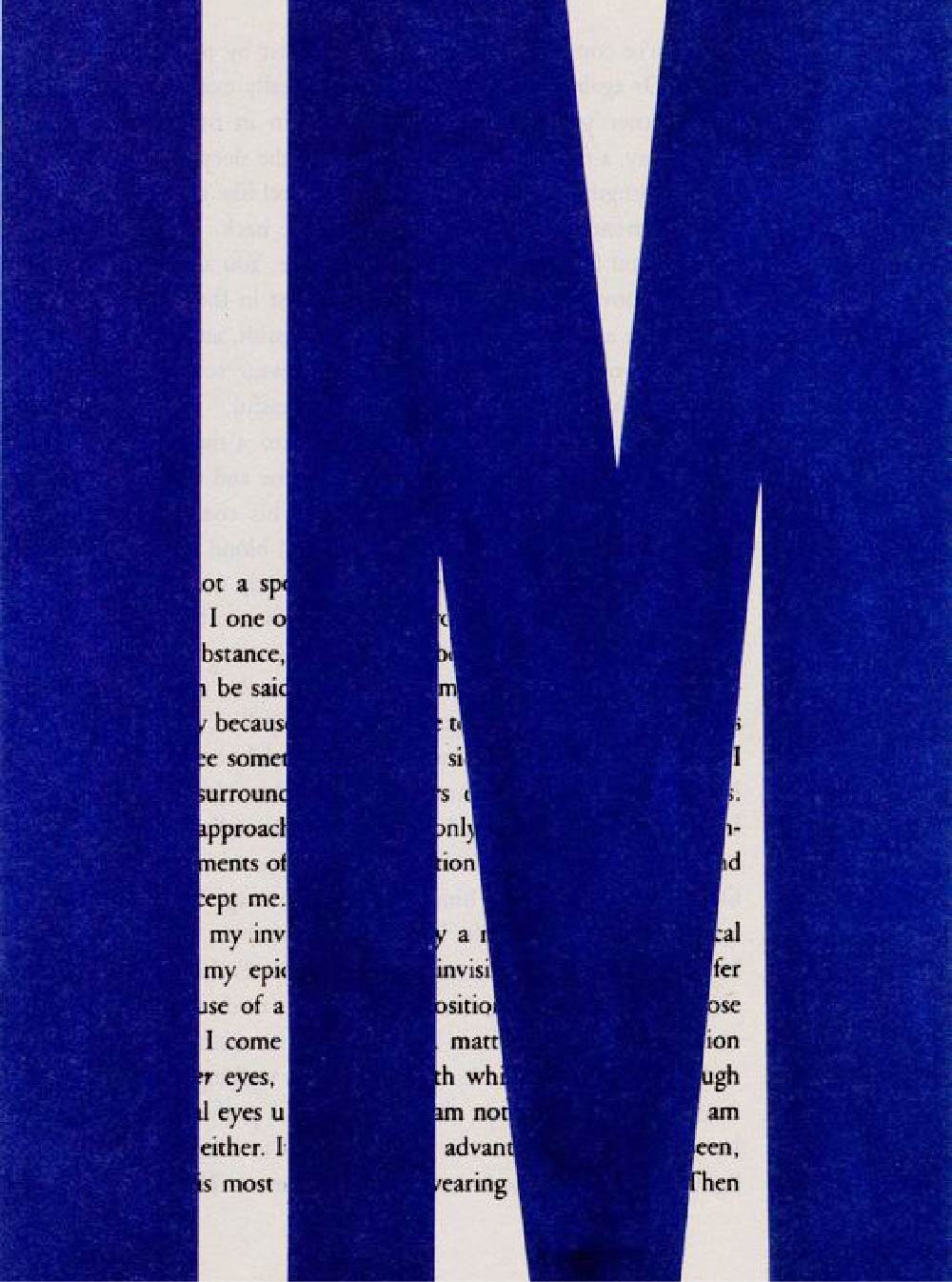
Luminous Blue bridges the past, present, and future. With interconnectivity as a defining WGSN theme for 2027 and the foundation of the key color selection, this striking shade was the perfect choice. Though associated with the semiprecious stone lapis lazuli?the basis of a vibrant blue pigment used for centuries?it also alludes to cobalt, the main component of lithium-ion batteries that are powering our current energy transition. This vibrant shade of blue connects us to traditional craft and dyeing techniques, continuing to bring people together through the exchange of knowledge and skills.
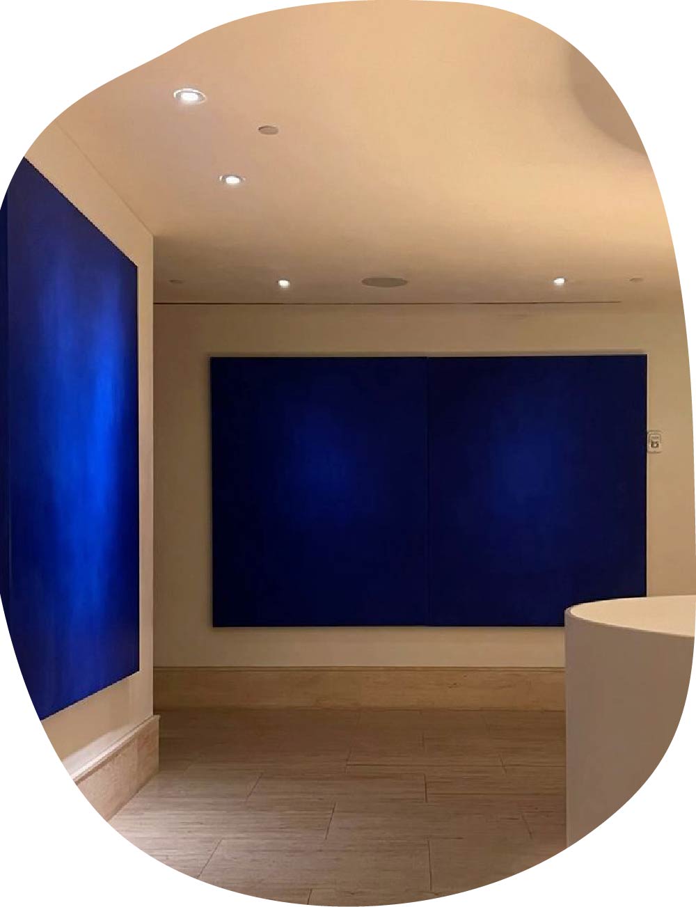
Before it becomes established, the moment for a new color emerges in the subtle repetition of signs, in places far too different to be a coincidence.
Luminous Blue appears as a response for a generation tired of constant overstimulation. It carries technology, digital presence, yet still preserves something contemplative across eras.
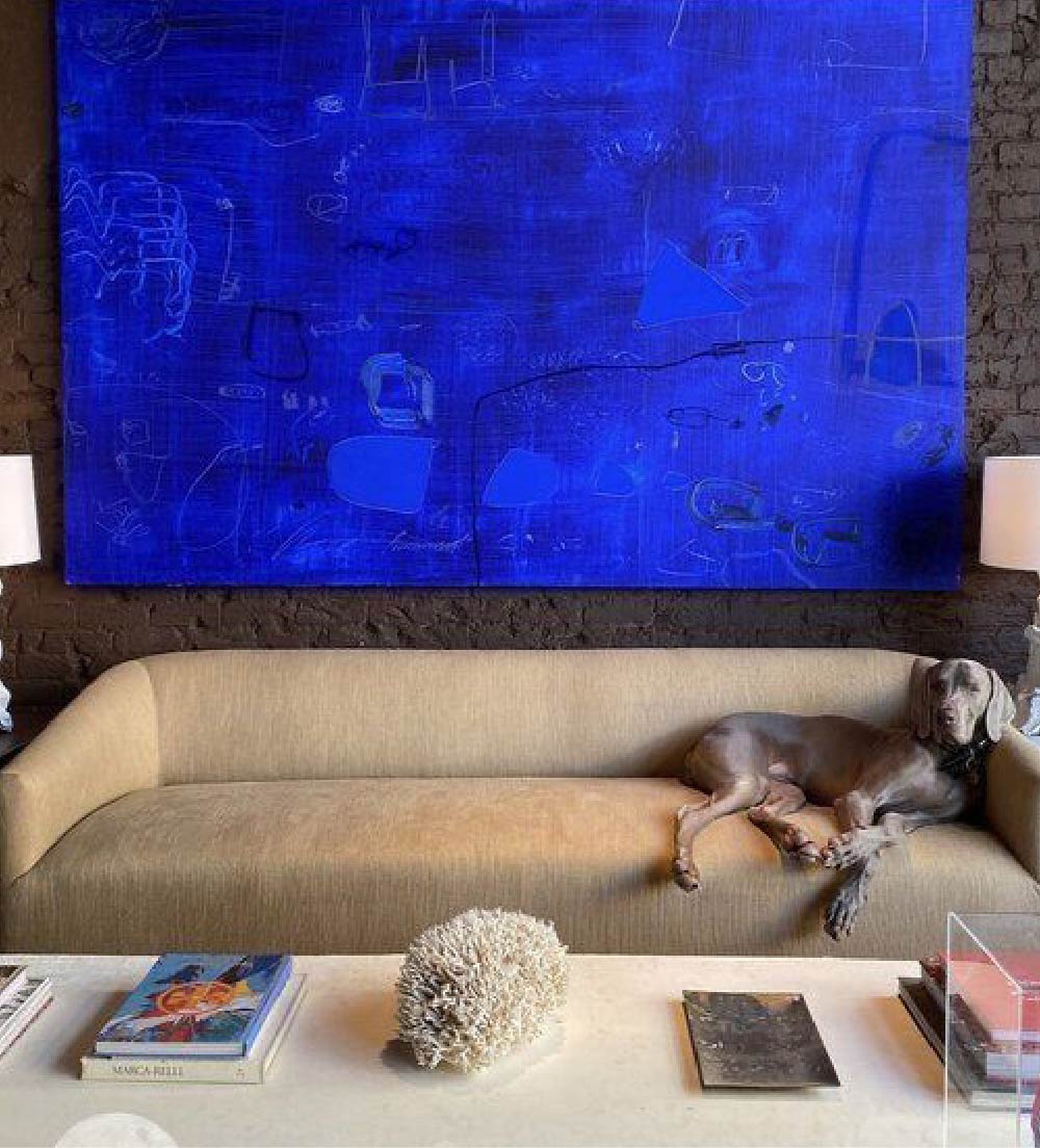
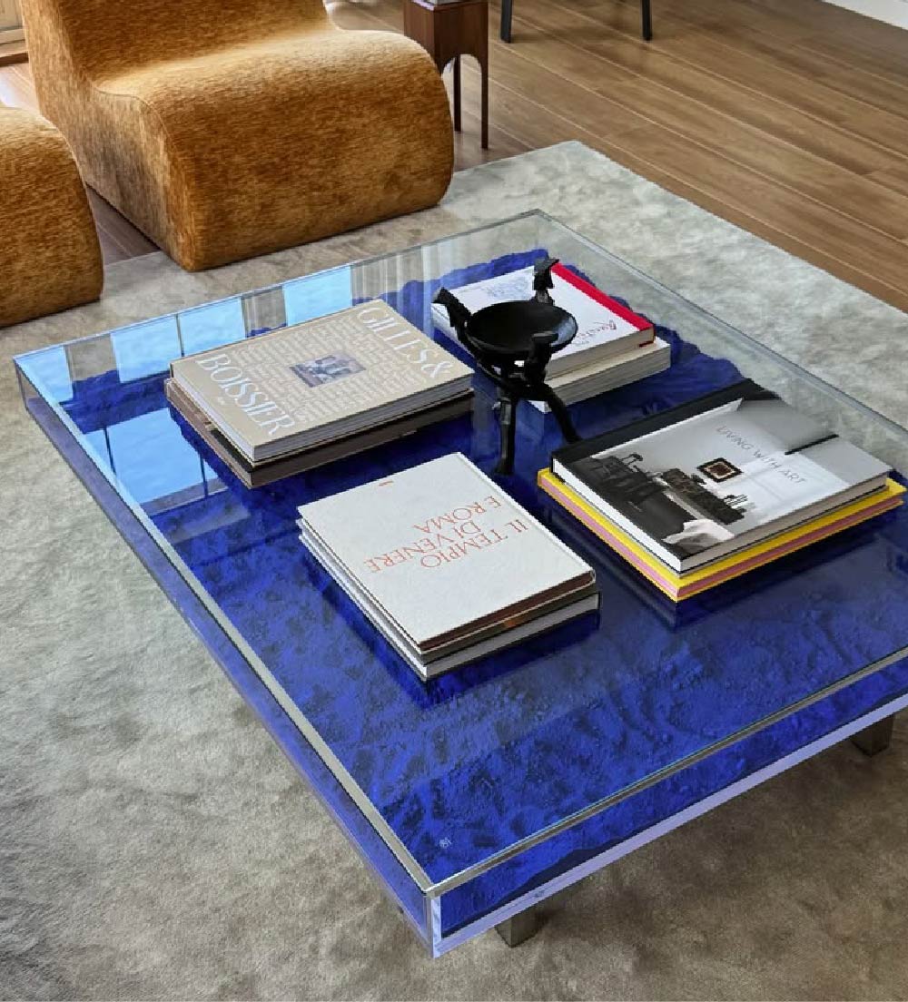
There are colors that transcend spectrums and take the lead in any palette?be it for their history, magic, or a unique combination of pigments.
It was in this universe of chromatic royalty that Klein blue was born. Developed in 1960 by the French artist Yves Klein, this ultramarine shade is characterized by its depth, vibrancy, and opacity, while aiming to mirror the infinity of the immaterial.
Over the decades, the color has become one of the main pillars of modern and contemporary art, and now returns to the spotlight.
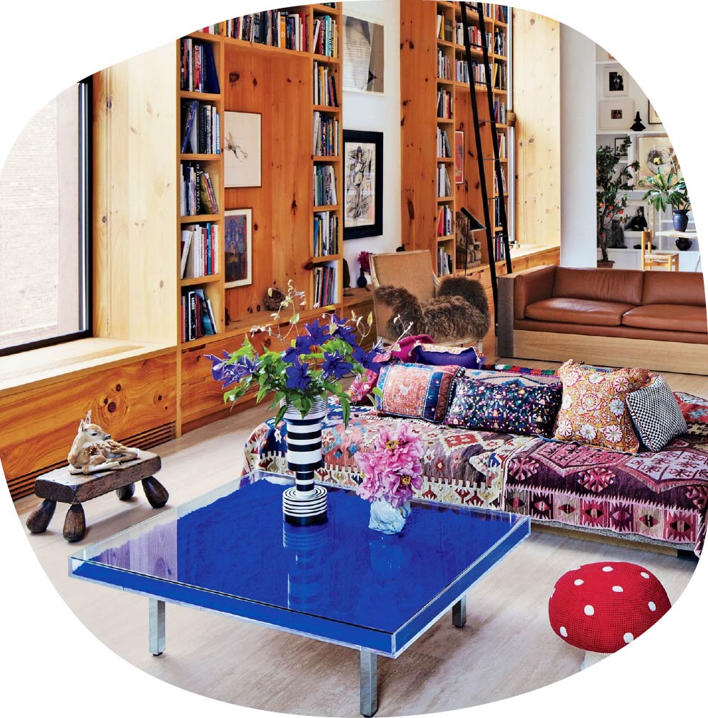
In color neuroscience, luminous blues often activate states linked to mental expansion, concentration, and spatial perception. Unlike deeper blues, which are associated with stability, this shade sparks something closer to the imagination.
It appears in small styling details, in almost monochromatic interiors, and never fails to be present in art galleries, serving as an immersive field of perception.
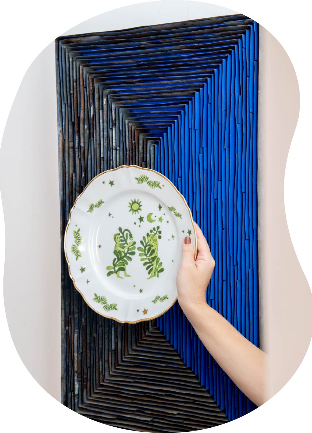
A blue that transits and travels through time, provoking in us the sensation of being new without causing any strangeness?on the contrary, it is intense and a timeless classic.
The Velvet Edit
Fully immersed in the new season, we make space for the textiles that welcome us during this time.
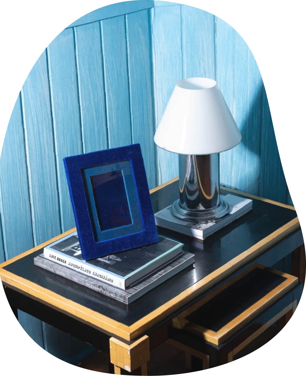
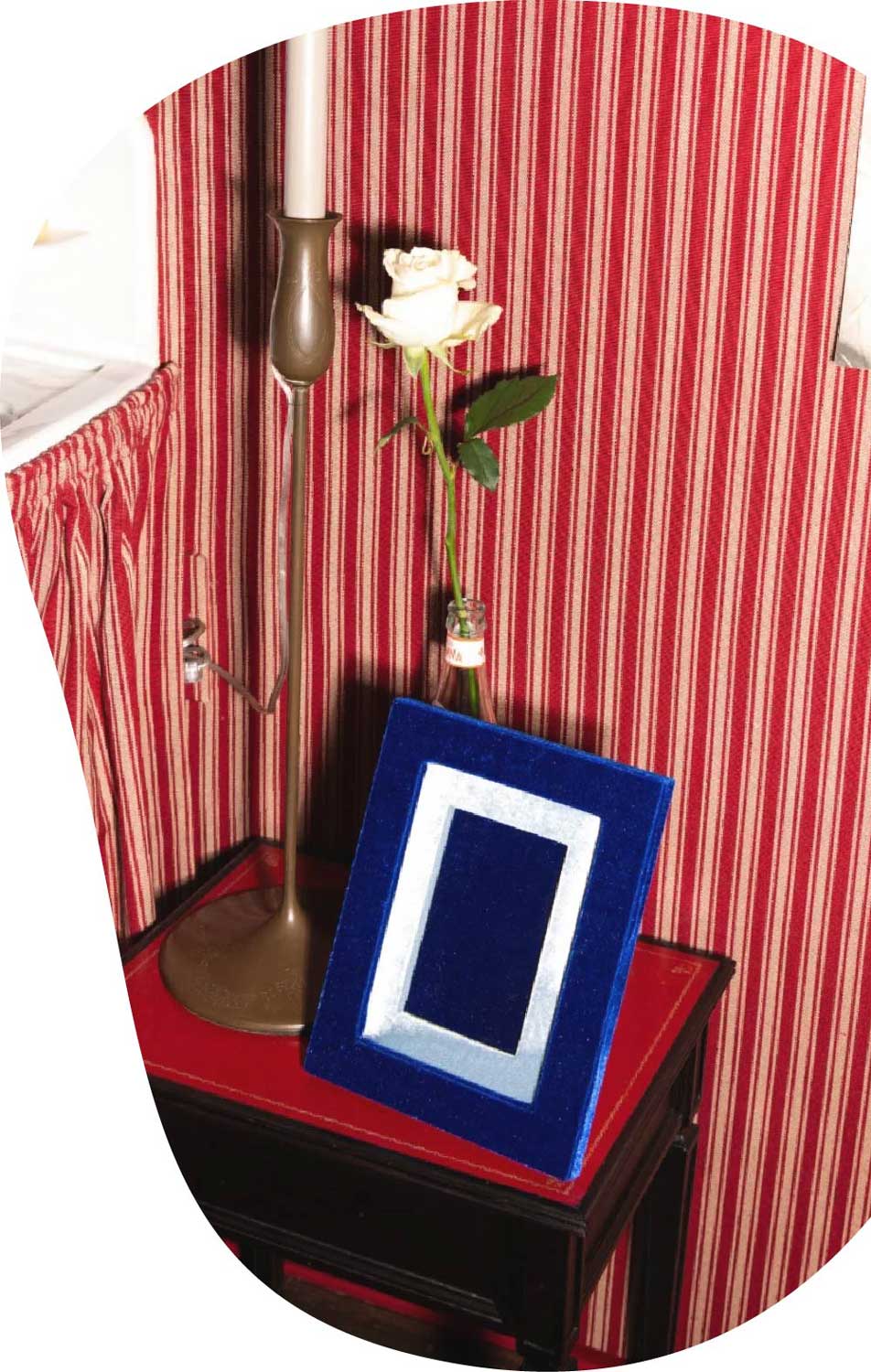
Where every frame is conceived as a textile document: a surface that holds memory, giving protagonism to photographs that tell stories in our homes and families.
OUR CONTENTS
The contents we are talking about and you may not have seen it yet.


 TH Wholesale
 WhatsApp